Home Prices Prediction Tutorial
https://www.kaggle.com/pmarcelino/comprehensive-data-exploration-with-python

이탤릭 볼드 이탤릭볼드
Workflow stages
- Question or problem definition.
- Acquire training and testing data.
- Wrangle, prepare, cleanse the data.
- Analyze, identify patterns, and explore the data.
- Model, predict and solve the problem.
- Visualize, report, and present the problem solving steps and final solution.
- Supply or submit the results.
기본적으로 설치되어 있어야하는 패키지는 아래 코드 를 사용한다.
import pandas as pd
import numpy as np
import random as rnd

# visualization
import seaborn as sns
import matplotlib.pyplot as plt
%matplotlib inline

# machine learning
from sklearn.linear_model import LogisticRegression
from sklearn.svm import SVC, LinearSVC
from sklearn.ensemble import RandomForestClassifier
from sklearn.neighbors import KNeighborsClassifier
from sklearn.naive_bayes import GaussianNB
from sklearn.linear_model import Perceptron
from sklearn.linear_model import SGDClassifier
from sklearn.tree import DecisionTreeClassifier
data 가져오기
train_df = pd.read_csv('../input/train.csv')
test_df = pd.read_csv('../input/test.csv')
combine = [train_df, test_df]
data를 찍어보면 다음과 같이 나온다
print(train_df.columns)
Index([‘Id’, ‘MSSubClass’, ‘MSZoning’, ‘LotFrontage’, ‘LotArea’, ‘Street’, ‘Alley’, ‘LotShape’, ‘LandContour’, ‘Utilities’, ‘LotConfig’, ‘LandSlope’, ‘Neighborhood’, ‘Condition1’, ‘Condition2’, ‘BldgType’, ‘HouseStyle’, ‘OverallQual’, ‘OverallCond’, ‘YearBuilt’, ‘YearRemodAdd’, ‘RoofStyle’, ‘RoofMatl’, ‘Exterior1st’, ‘Exterior2nd’, ‘MasVnrType’, ‘MasVnrArea’, ‘ExterQual’, ‘ExterCond’, ‘Foundation’, ‘BsmtQual’, ‘BsmtCond’, ‘BsmtExposure’, ‘BsmtFinType1’, ‘BsmtFinSF1’, ‘BsmtFinType2’, ‘BsmtFinSF2’, ‘BsmtUnfSF’, ‘TotalBsmtSF’, ‘Heating’, ‘HeatingQC’, ‘CentralAir’, ‘Electrical’, ‘1stFlrSF’, ‘2ndFlrSF’, ‘LowQualFinSF’, ‘GrLivArea’, ‘BsmtFullBath’, ‘BsmtHalfBath’, ‘FullBath’, ‘HalfBath’, ‘BedroomAbvGr’, ‘KitchenAbvGr’, ‘KitchenQual’, ‘TotRmsAbvGrd’, ‘Functional’, ‘Fireplaces’, ‘FireplaceQu’, ‘GarageType’, ‘GarageYrBlt’, ‘GarageFinish’, ‘GarageCars’, ‘GarageArea’, ‘GarageQual’, ‘GarageCond’, ‘PavedDrive’, ‘WoodDeckSF’, ‘OpenPorchSF’, ‘EnclosedPorch’, ‘3SsnPorch’, ‘ScreenPorch’, ‘PoolArea’, ‘PoolQC’, ‘Fence’, ‘MiscFeature’, ‘MiscVal’, ‘MoSold’, ‘YrSold’, ‘SaleType’, ‘SaleCondition’, ‘SalePrice’], dtype=’object’)
위와같은 카테고리로 되어있으며 data를 몇개 찍어보면 다음과 같다.
1. 우리는 무엇을 기대하는가?
우리의 데이터에 따르면 문제를 해결하기 위한 각 데이터 사이의 의미(meaning)와 관련성(relevance)을 찾을 수있다.
- Variable - Variable name.
- Type - Identification of the variables’ type. There are two possible values for this field: ‘numerical’ or ‘categorical’. By ‘numerical’ we mean variables for which the values are numbers, and by ‘categorical’ we mean variables for which the values are categories.
- Segment - Identification of the variables’ segment. We can define three possible segments: building, space or location. When we say ‘building’, we mean a variable that relates to the physical characteristics of the building (e.g. ‘OverallQual’). When we say ‘space’, we mean a variable that reports space properties of the house (e.g. ‘TotalBsmtSF’). Finally, when we say a ‘location’, we mean a variable that gives information about the place where the house is located (e.g. ‘Neighborhood’).
- Expectation - Our expectation about the variable influence in ‘SalePrice’. We can use a categorical scale with ‘High’, ‘Medium’ and ‘Low’ as possible values.
- Conclusion - Our conclusions about the importance of the variable, after we give a quick look at the data. We can keep with the same categorical scale as in ‘Expectation’.
- Comments - Any general comments that occured to us.
2. 먼저 첫번째: ‘SalePrice’ 의 분석
우리가 얻고자 하는 것은 미래의 ‘SalePrice’이다. 주어진 Data를 통계적으로 분석해 보도록 한다.
print(df_train['SalePrice'].describe())
count | 1460.000000 mean | 180921.195890 std | 79442.502883 min | 34900.000000 25% | 129975.000000 50% | 163000.000000 75% | 214000.000000 max | 755000.000000 Name: SalePrice, dtype: float64
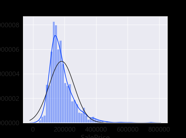
sns.distplot(df_train['SalePrice']);
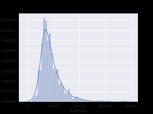
그래프의 왜도(Skewness) 와 첨도 (Kurtosis) 구하기
print("Skewness: %f" % df_train['SalePrice'].skew())
print("Kurtosis: %f" % df_train['SalePrice'].kurt())
Skewness: 1.882876 (분포가 대칭을 벗어나 한쪽으로 치우친 정도) Kurtosis: 6.536282 (첨도는 연구자들이 많은 양의 자료에 대하여 빨리 감지할 수 있도록 해 주는 여러 유용한 통계 중 하나로서, 분포의 ‘정점(peakedness)’을 뜻하는 그리스어에서 파생)
SalePrice와 다른 실수형 변수들의 관계를 확인
#scatter plot grlivarea/saleprice
var = 'GrLivArea'
data = pd.concat([df_train['SalePrice'], df_train[var]], axis=1)
data.plot.scatter(x=var, y='SalePrice', ylim=(0,800000));
 선형 관계인것 처럼 보인다.
#scatter plot totalbsmtsf/saleprice
var = 'TotalBsmtSF'
data = pd.concat([df_train['SalePrice'], df_train[var]], axis=1)
data.plot.scatter(x=var, y='SalePrice', ylim=(0,800000));
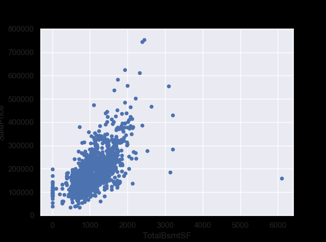 선형 관계?
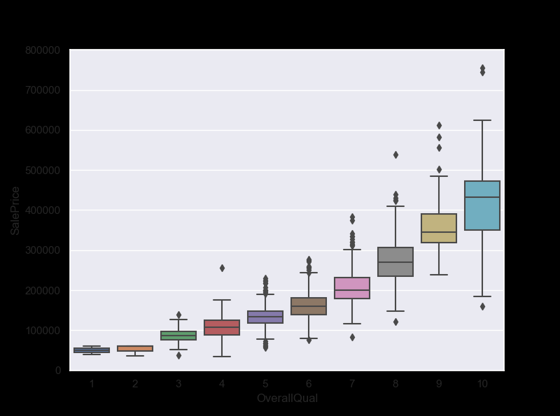
SalePrice와 다른 범주형 변수들의 관계를 확인
#box plot overallqual/saleprice
var = 'OverallQual' # OverallQual =집의 전반적인 가격
data = pd.concat([df_train['SalePrice'], df_train[var]], axis=1)
f, ax = plt.subplots(figsize=(8, 6))
fig = sns.boxplot(x=var, y="SalePrice", data=data)
fig.axis(ymin=0, ymax=800000);
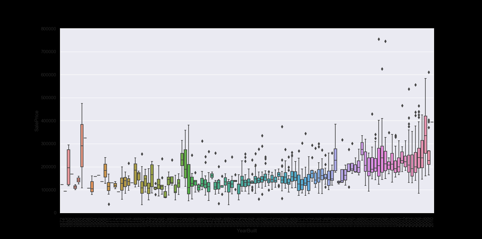
var = 'YearBuilt'
data = pd.concat([df_train['SalePrice'], df_train[var]], axis=1)
f, ax = plt.subplots(figsize=(16, 8))
fig = sns.boxplot(x=var, y="SalePrice", data=data)
fig.axis(ymin=0, ymax=800000);
plt.xticks(rotation=90);
In summary
Stories aside, we can conclude that:
‘GrLivArea’ and ‘TotalBsmtSF’ seem to be linearly related with ‘SalePrice’. Both relationships are positive, which means that as one variable increases, the other also increases. In the case of ‘TotalBsmtSF’, we can see that the slope of the linear relationship is particularly high. ‘OverallQual’ and ‘YearBuilt’ also seem to be related with ‘SalePrice’. The relationship seems to be stronger in the case of ‘OverallQual’, where the box plot shows how sales prices increase with the overall quality. We just analysed four variables, but there are many other that we should analyse. The trick here seems to be the choice of the right features (feature selection) and not the definition of complex relationships between them (feature engineering).
3. 스마트하게 일하기
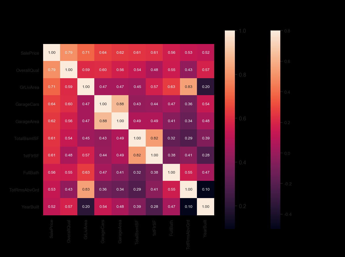
Correlation matrix (heatmap style)
#correlation matrix
corrmat = df_train.corr()
f, ax = plt.subplots(figsize=(12, 9))
sns.heatmap(corrmat, vmax=.8, square=True);

hitmap을 사용하는 것은 변수간 관계를 보는데 가장 좋은 방법중에 하나이다.
#saleprice correlation matrix
k = 10 #number of variables for heatmap
cols = corrmat.nlargest(k, 'SalePrice')['SalePrice'].index
cm = np.corrcoef(df_train[cols].values.T)
sns.set(font_scale=1.25)
hm = sns.heatmap(cm, cbar=True, annot=True, square=True, fmt='.2f', annot_kws={'size': 10}, yticklabels=cols.values, xticklabels=cols.values)
plt.show()
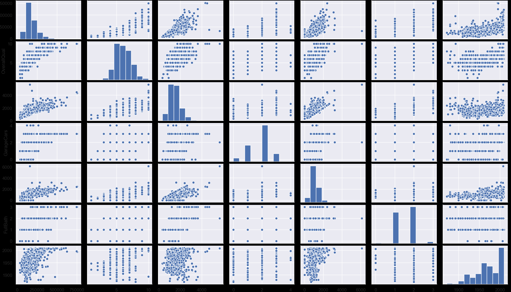
Scatter plot을 사용하여 Sales Price와 상관 변수사이 확인
#scatterplot
sns.set()
cols = ['SalePrice', 'OverallQual', 'GrLivArea', 'GarageCars', 'TotalBsmtSF', 'FullBath', 'YearBuilt']
sns.pairplot(df_train[cols], size = 2.5)
plt.show();
4. 유실데이터
유실 데이터는 분석에 큰 영향을 줄 수 있다. 영향을 받지 않도록 방지하는 작업을 해야한다.
#missing data
total = df_train.isnull().sum().sort_values(ascending=False)
percent = (df_train.isnull().sum()/df_train.isnull().count()).sort_values(ascending=False)
missing_data = pd.concat([total, percent], axis=1, keys=['Total', 'Percent'])
print(missing_data.head(20))
Total Percent PoolQC 1453 0.995205 MiscFeature 1406 0.963014 Alley 1369 0.937671 Fence 1179 0.807534 FireplaceQu 690 0.472603 LotFrontage 259 0.177397 GarageCond 81 0.055479
데이터 유실이 많은 데이터는 삭제해 준다
#dealing with missing data
df_train = df_train.drop((missing_data[missing_data['Total'] > 1]).index,1)
df_train = df_train.drop(df_train.loc[df_train['Electrical'].isnull()].index)
df_train.isnull().sum().max() #just checking that there's no missing data missing...
아웃라이어 컨트롤
아웃라이어 또한 분석에 영향을 미칠 수 있다. Outliers is a complex subject and it deserves more attention. Here, we’ll just do a quick analysis through the standard deviation of ‘SalePrice’ and a set of scatter plots.
아웃라이어의 임계점(threshold)을 정의해줄 필요가 있다. The primary concern here is to establish a threshold that defines an observation as an outlier. To do so, we’ll standardize the data. In this context, data standardization means converting data values to have mean of 0 and a standard deviation of 1.
Univariate analysis(단변량 분석)
#standardizing data
saleprice_scaled = StandardScaler().fit_transform(df_train['SalePrice'][:,np.newaxis]);
low_range = saleprice_scaled[saleprice_scaled[:,0].argsort()][:10]
high_range= saleprice_scaled[saleprice_scaled[:,0].argsort()][-10:]
print('outer range (low) of the distribution:')
print(low_range)
print('\nouter range (high) of the distribution:')
print(high_range)
outer range (low) of the distribution: [[-1.83820775] [-1.83303414] [-1.80044422] [-1.78282123] [-1.77400974] [-1.62295562] [-1.6166617 ] [-1.58519209] [-1.58519209] [-1.57269236]]
outer range (high) of the distribution: [[3.82758058] [4.0395221 ] [4.49473628] [4.70872962] [4.728631 ] [5.06034585] [5.42191907] [5.58987866] [7.10041987] [7.22629831]]
Low range values are similar and not too far from 0.
High range values are far from 0 and the 7.something values are really out of range.
Bivariate analysis(이변량 분석)
#bivariate analysis saleprice/grlivarea
var = 'GrLivArea'
data = pd.concat([df_train['SalePrice'], df_train[var]], axis=1)
data.plot.scatter(x=var, y='SalePrice', ylim=(0,800000));

GrLivArea 의 2개의 값이 집군에서 상당히 떨어져 있는 것으로 보아 아웃라이어로 보인다. 아웃라이어를 날려준다.
#deleting points
df_train.sort_values(by = 'GrLivArea', ascending = False)[:2]
df_train = df_train.drop(df_train[df_train['Id'] == 1299].index)
df_train = df_train.drop(df_train[df_train['Id'] == 524].index)
5. 하드코어 얻기
-
Normality(정규성) - When we talk about normality what we mean is that the data should look like a normal distribution. This is important because several statistic tests rely on this (e.g. t-statistics). In this exercise we’ll just check univariate normality for ‘SalePrice’ (which is a limited approach). Remember that univariate normality doesn’t ensure multivariate normality (which is what we would like to have), but it helps. Another detail to take into account is that in big samples (>200 observations) normality is not such an issue. However, if we solve normality, we avoid a lot of other problems (e.g. heteroscedacity) so that’s the main reason why we are doing this analysis.
-
Homoscedasticity(동질성) - I just hope I wrote it right. Homoscedasticity refers to the ‘assumption that dependent variable(s) exhibit equal levels of variance across the range of predictor variable(s)’ (Hair et al., 2013). Homoscedasticity is desirable because we want the error term to be the same across all values of the independent variables.
-
Linearity(선형성) - The most common way to assess linearity is to examine scatter plots and search for linear patterns. If patterns are not linear, it would be worthwhile to explore data transformations. However, we’ll not get into this because most of the scatter plots we’ve seen appear to have linear relationships.
-
Absence of correlated errors - Correlated errors, like the definition suggests, happen when one error is correlated to another. For instance, if one positive error makes a negative error systematically, it means that there’s a relationship between these variables. This occurs often in time series, where some patterns are time related. We’ll also not get into this. However, if you detect something, try to add a variable that can explain the effect you’re getting. That’s the most common solution for correlated errors.
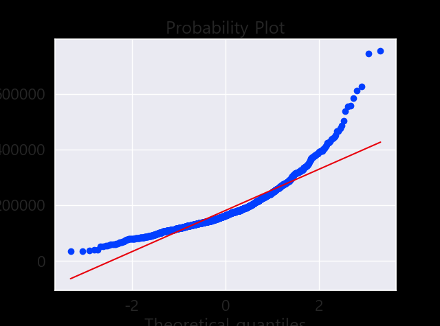
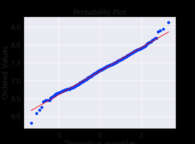
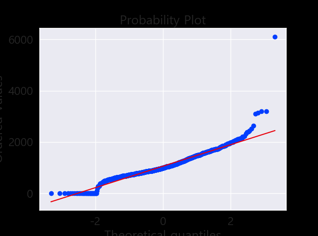
정규성 찾기
- Histogram - Kurtosis and skewness.
- Normal probability plot - Data distribution should closely follow the diagonal that represents the normal distribution.
#histogram and normal probability plot
sns.distplot(df_train['SalePrice'], fit=norm);
fig = plt.figure()
res = stats.probplot(df_train['SalePrice'], plot=plt)
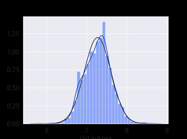
데이터 정규화
#data transformation
df_train['GrLivArea'] = np.log(df_train['GrLivArea'])
#histogram and normal probability plot
sns.distplot(df_train['TotalBsmtSF'], fit=norm);
fig = plt.figure()
res = stats.probplot(df_train['TotalBsmtSF'], plot=plt)
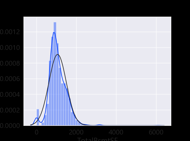
- Something that, in general, presents skewness.
- A significant number of observations with value zero (houses without basement).
- A big problem because the value zero doesn’t allow us to do log transformations.